Element
An Element component when in a hierarchy with a Screen Component ancestor is used to build user interfaces made up of 2D components such as images and text. The Element provides layout properties such as anchors and a pivot point.
See the User Interface section for more details.
Group Element
The group element provides just the layout properties of the Element component
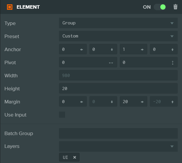
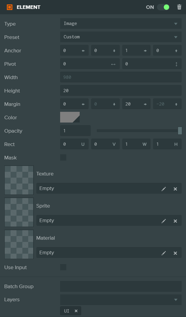
Image Element
The image element displays an image using a texture asset or a solid color.
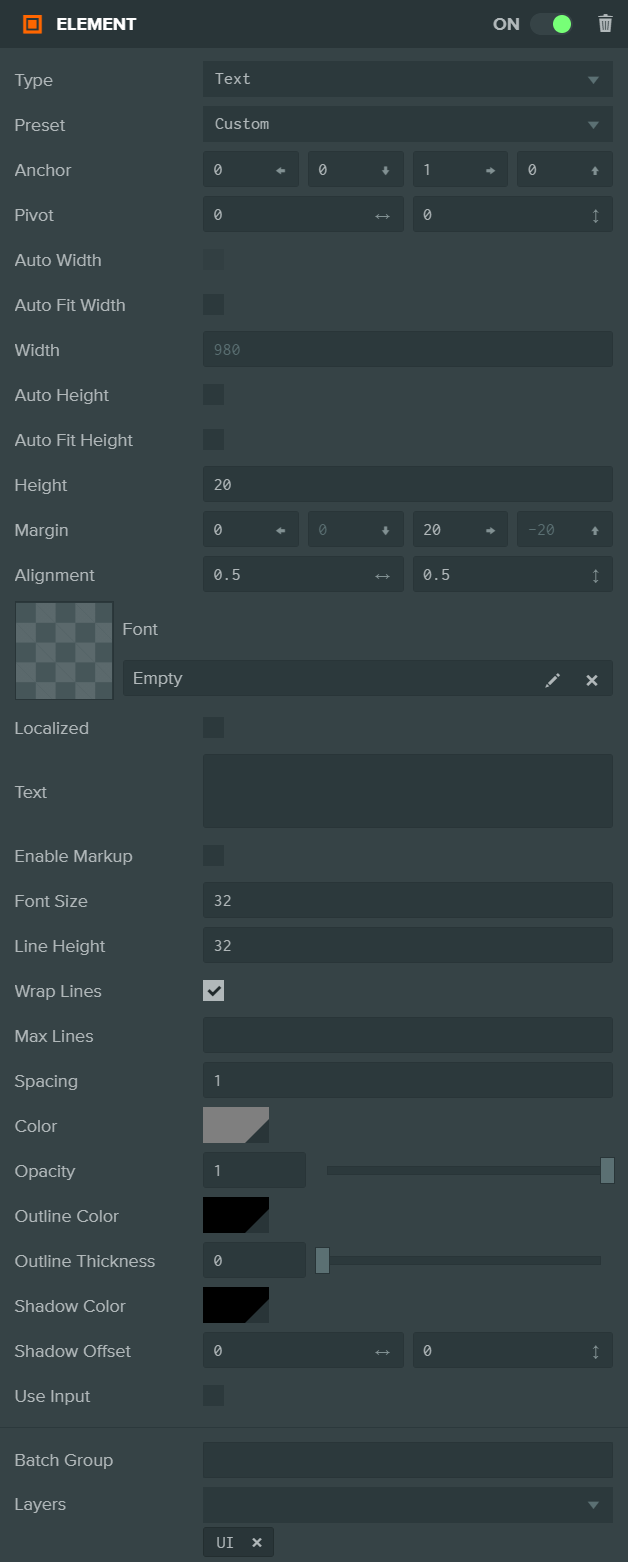
Text Element
The text element renders a string of text using a font asset.
Common Component Properties
| Property | Description |
|---|---|
| Type | The type of Element: Group, Image or Text. |
| Preset | Choosing a layout preset will automatically set the Anchor and Pivot properties to a preset value. |
| Anchor | Determine where the element calculates its position in relation to. See the Elements#Anchor section for more information. |
| Pivot | Determine where the pivot point of the Element is. (0, 0) is bottom left, (1, 1) is top right. See the Elements#Pivot section for more information. |
| Size | The width and height of the Element. This may be automatically calculated depending on other settings. |
| Margin | The distance from the edge of the element to the Anchor. This is only available when the Anchor is split (non-equal in one axis). |
| Use Input | If enabled, this Element is added to the list of elements that check for input and fire input related events. |
| Layers | The Layers to render this element into. More on Layers here. |
| Batch Group | The Batch Group that this model belongs to. More on Batching here. |
Image Component Properties
| Property | Description |
|---|---|
| Rect | Define the area of the texture asset to display. |
| Mask | Switch Image Element into a mask. Masks do not render into the scene, but instead limit child elements to only be rendered where this element is rendered. |
| Texture | The texture asset displayed. |
| Color | The color to tint the element. |
| Opacity | The transparency of the element. |
Text Component Properties
| Property | Description |
|---|---|
| Alignment | Determine how the text is aligned with in the element. (0, 0) is bottom left, (1, 1) is top right. |
| Text | The text string to display. |
| Font Size | The size in Screen component pixels to render the font at. |
| Line Height | The size in Screen component pixels to move down for a new line. |
| Spacing | A multiplier to apply to the amount advanced between each character. |
| Font | The font asset. |
| Color | The color to tint the font. |
| Opacity | The transparency of the element. |
| Wrap Lines | Enable text wrapping. Any text that overflows the width of the text element will be wrapped to the next line. |