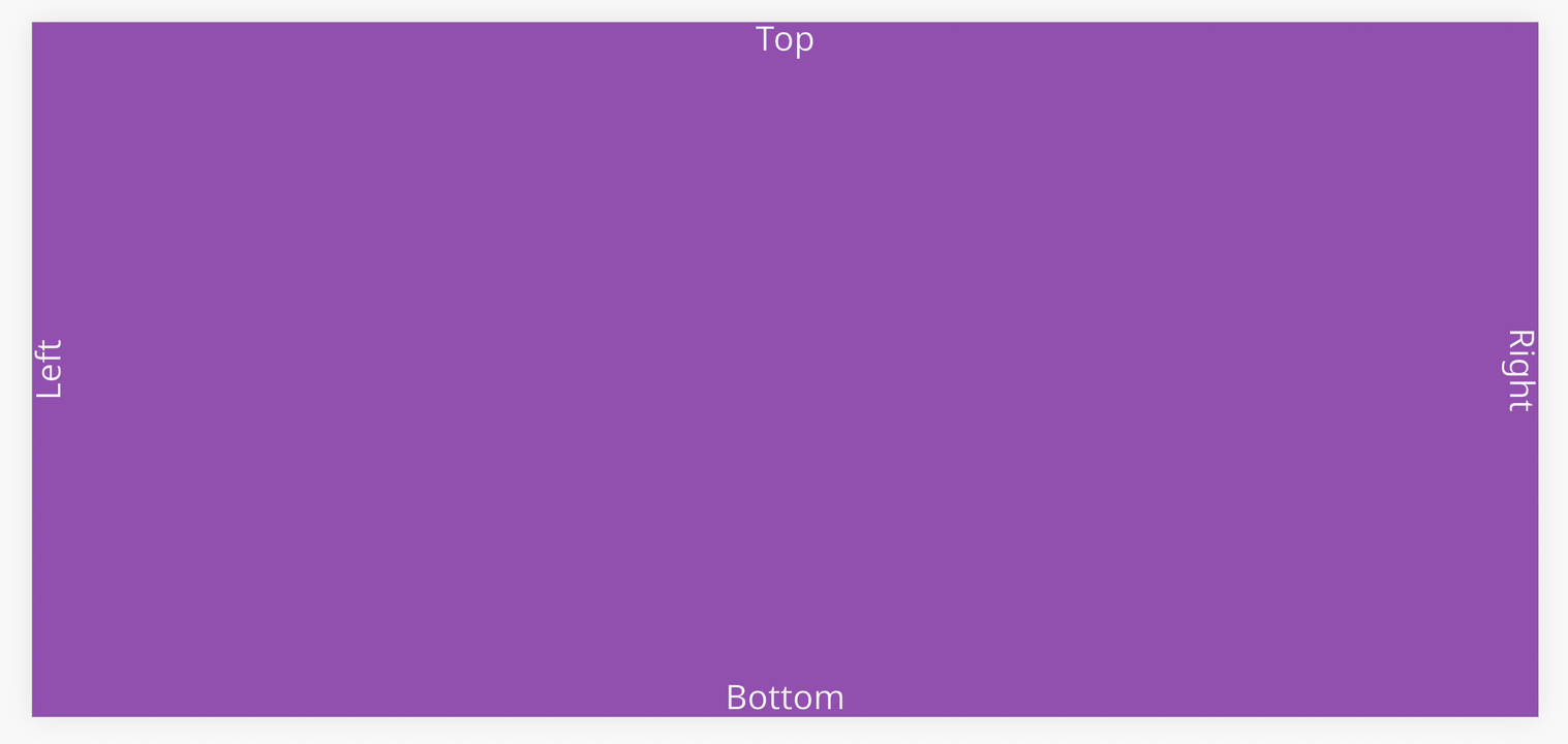
Safe Area
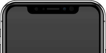
With the trend of mobile devices having full device screens, a notch or cut out in the display is used to make room for the ear piece speaker and front facing camera (see below for the iPhone X).
(Image Original: Rafael Fernandez, Modified version:PlayCanvas, CC BY-SA 4.0, via Wikimedia Commons)
Developers will need to be mindful of any essential information that is needed for the user which could be hidden by the notch during development.
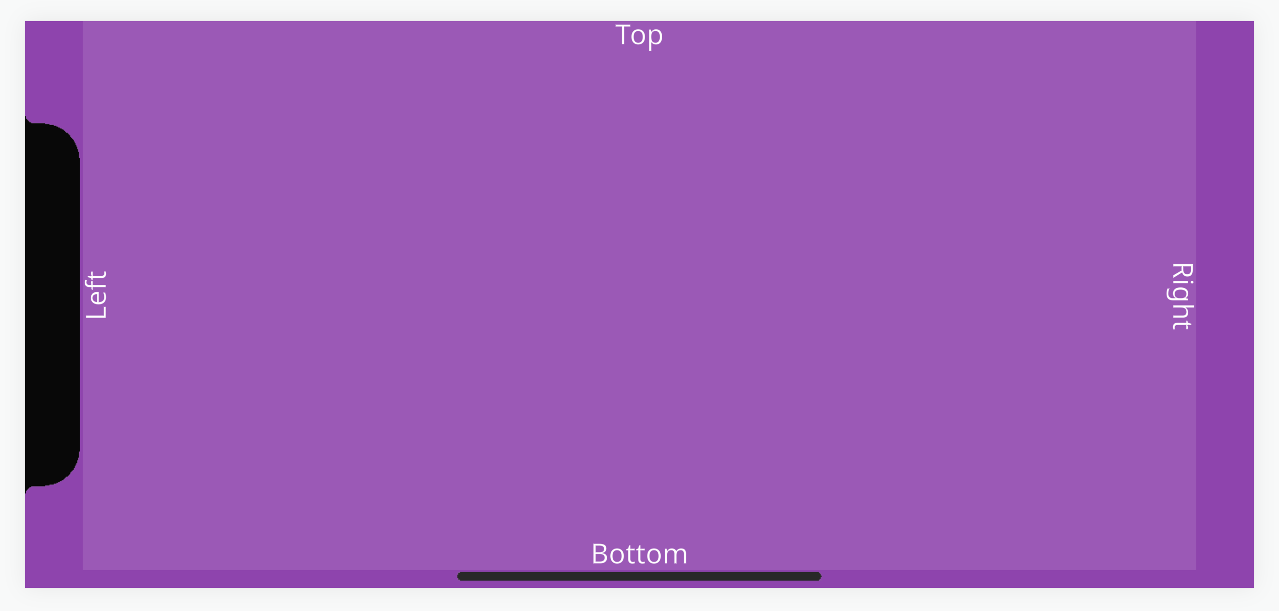
For example, the screenshot below looks fine on desktop in devtools mobile view.
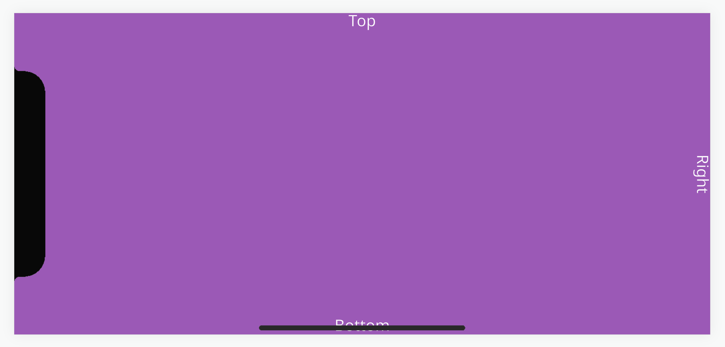
However, when opened on a mobile device such as the iPhone X, the 'Left' text is rendered under the notch and the 'Bottom' text is rendered under the navigation bar.
Safe Area
To help developers, browsers on the these devices do support environment variables in CSS to return values for positioning elements within an area that is occupied by the notch or navigation bar. This is known as a 'safe area'.
We have a project with a reusable script that takes those CSS values and applies them to an UI Group Element entity via resizing the margins.
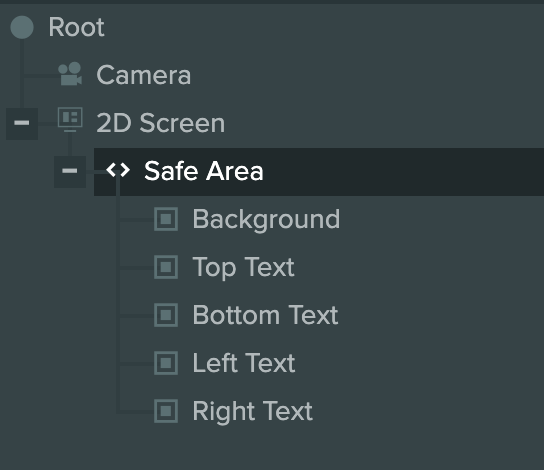
The UI setup in the project has an Entity with a full screen Group Element named 'Safe Area'. This has the script 'mobileSafeArea' attached which contains the logic for fitting the Element within the safe area of the device.
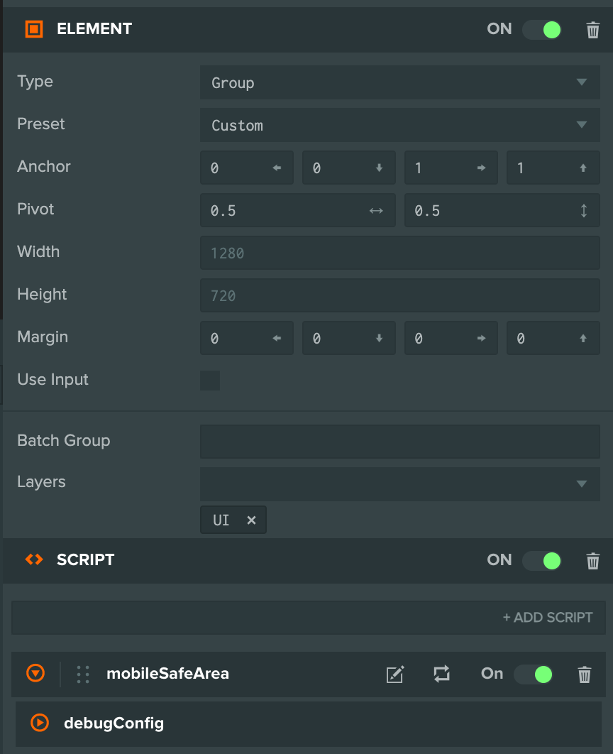
Any essential UI Elements can be placed as a child of the Safe Area Entity to be anchored relative to it.

To help with development, a debug setting can be enabled to simulate a safe area to preview what a UI layout would look like without needing a device.
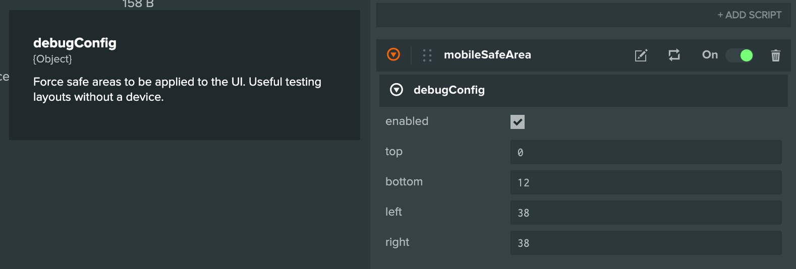
The debug config can be edited with live updates in the launch tab too.