User Interface - Progress Bar
A progress bar using Element components. See the full scene.
We can easily create progress bars using the built-in Elements. In this tutorial we have a progress bar that loops from empty to full every few seconds.
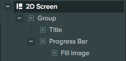
Hierarchy
This is what our UI looks like in the Hierarchy:
Screen setup
Our screen is set up like so:
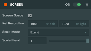
Since it's a 2D screen we have ticked Screen Space. Our Reference Resolution is the resolution that we are targeting - in this case it's 1080 x 1920. We choose Blend for Scale Mode so that our Screen adapts to resolution changes and we set Scale Blend to 1 so that the Screen will adapt only to height changes.
The screen has a child Text Element to show the POWER text and an Entity called Progress Bar which show our progress bar.
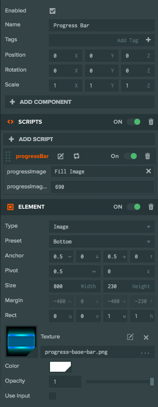
Progress Bar setup
The progress bar is made of 2 Elements. The background image and the fill image.
The background image is the Progress Bar entity in our example. It has an Image Element and it shows the background image of the
progress bar:
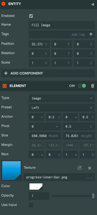
The fill image is the Fill Image entity in our example. It is a child of the Progress Bar entity and it has an Image
Element to show the fill of the progress bar. This image is anchored to the left of its parent background image. That allows us to change the
width of the element in order to make the progress bar grow.
Script
The Progress Bar entity has a script to control how the progress bar is resized:
var ProgressBar = pc.createScript('progressBar');

// The entity that shows the fill image
ProgressBar.attributes.add('progressImage', {type: 'entity'});
// The maximum width of the fill image
ProgressBar.attributes.add('progressImageMaxWidth', {type: 'number'});

ProgressBar.prototype.initialize = function() {
    // use our own rect object to set the size of
    // the progress bar
    this.imageRect = this.progressImage.element.rect.clone();

    // initialize progress to 0
    this.setProgress(0);
    // if true the progress bar will increase
    // otherwise it will decrease in update
    this.increase = true;
};

// Set progress - value is between 0 and 1
ProgressBar.prototype.setProgress = function (value) {
    // clamp value between 0 and 1
    value = pc.math.clamp(value, 0, 1);

    this.progress = value;

    // find the desired width of our progress fill image
    var width = pc.math.lerp(0, this.progressImageMaxWidth, value);
    // set the width of the fill image element
    this.progressImage.element.width = width;

    // Set the width of the element's rect (rect.z) to be the same
    // value as our 0-1 progress.
    // This is so that the fill image will only show the portion
    // of the texture that is visible
    this.imageRect.copy(this.progressImage.element.rect);
    this.imageRect.z = value;
    // force rect update
    this.progressImage.element.rect = this.progressImage.element.rect;
};

// Increase or decrease the progress automatically
ProgressBar.prototype.update = function(dt) {
    var diff = this.increase ? dt : -dt;
    this.setProgress(this.progress + diff);

    if (this.progress >= 1)
        this.increase = false;
    else if (this.progress <= 0)
        this.increase = true;
};
The script has 2 attributes - the Entity that shows the fill image and the max width of that image. It has a setProgress function
which sets the progress to a value between 0 and 1.
The update method essentially loops progress between 0 and 1. The important thing to note in this script is how we need to change
the width and the rect of the fill image in order to properly resize our progress bar.
Changing the width makes the fill image larger and changing the rect makes sure that we only show the portion of the
texture that is visible, so that we avoid stretching the visible texture. Here is the API
reference for rect.