User Interface - Buttons
Simple buttons using Element and Button components. See the full scene.
When building a UI for your application you will almost certainly need to create buttons. This tutorial demonstrates how you can achieve that using the built-in Elements.
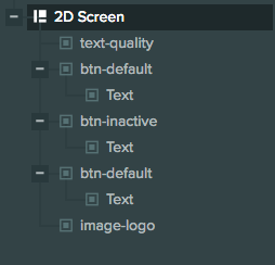
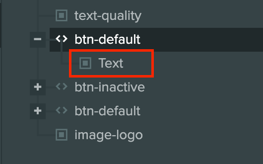
In this scene we have created a 2D Screen that looks like this in the hierarchy:
Screen setup
Our screen is set up like so:
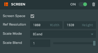
Since it's a 2D screen we have ticked Screen Space. Our Reference Resolution is the resolution that we are targeting - in this case it's 1080 x 1920. We choose Blend for Scale Mode so that our Screen adapts to resolution changes and we set Scale Blend to 1 so that the Screen will adapt only to height changes.
Our screen has various children like an Image Element for the logo that is displayed on the top, a Text Element for showing the 'SELECT QUALITY' text and 3 buttons.
Adding a button to the UI
There are two ways to add a button to the scene.
Via the Hierarchy Panel
This is the easiest way to add a button to the scene as it creates the necessary entities, components and preconfigures the properties.
With an existing Element
If there is an existing Element that we would like to turn into a button, we can add Button component to it in the Inspector panel and configure it ourselves.
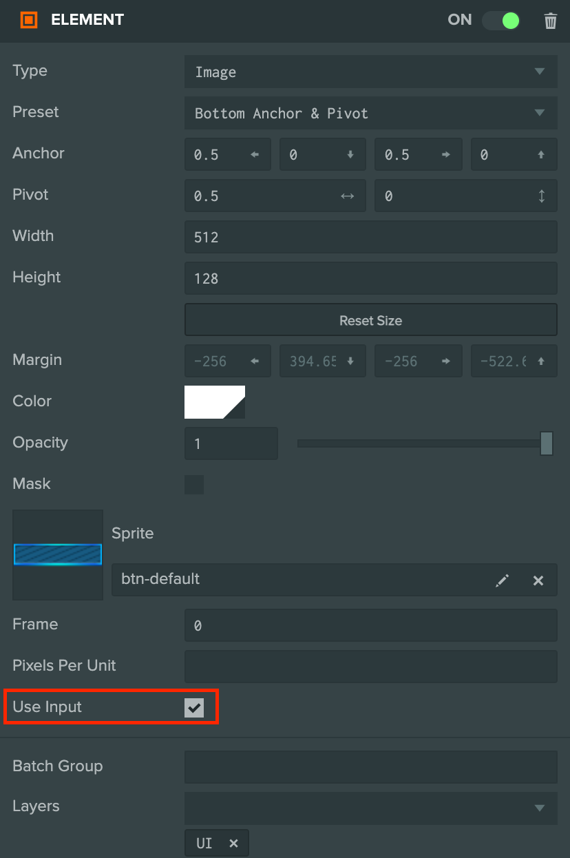
Remember to enable Use Input on the Element component so the user can interact with it:
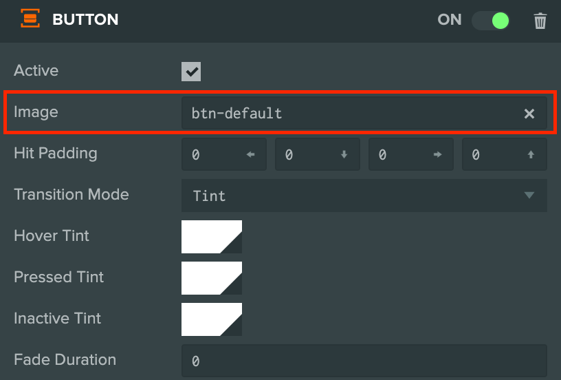
And set the Image Entity property on the Button component to be same Entity that the Element component is on.
Button setup
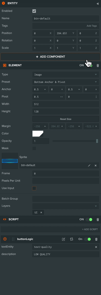
Let's take a closer look at the first button in the example project:
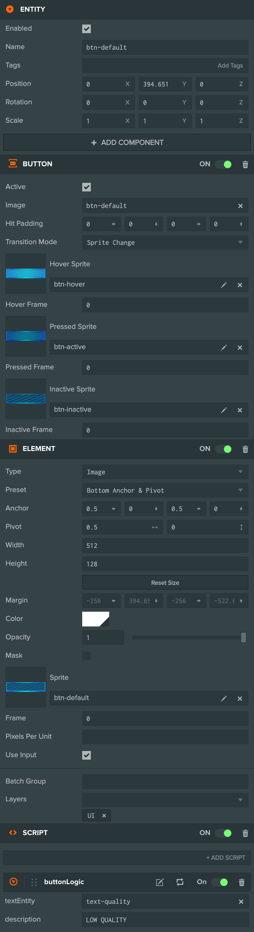
The button has 3 components:
- Element component - Positions the renders the button UI relative to it's parent Screen.
- Button component - Handles how the button looks when the user is interacting with it.
- Script component - Listens for events on the Button component and handles the logic on what to do when clicked.
The button Entity also has a Text Element as a child for showing text (this is optional depending on the style of your button).
The Element's type is Image and it's anchored to the bottom of the screen.
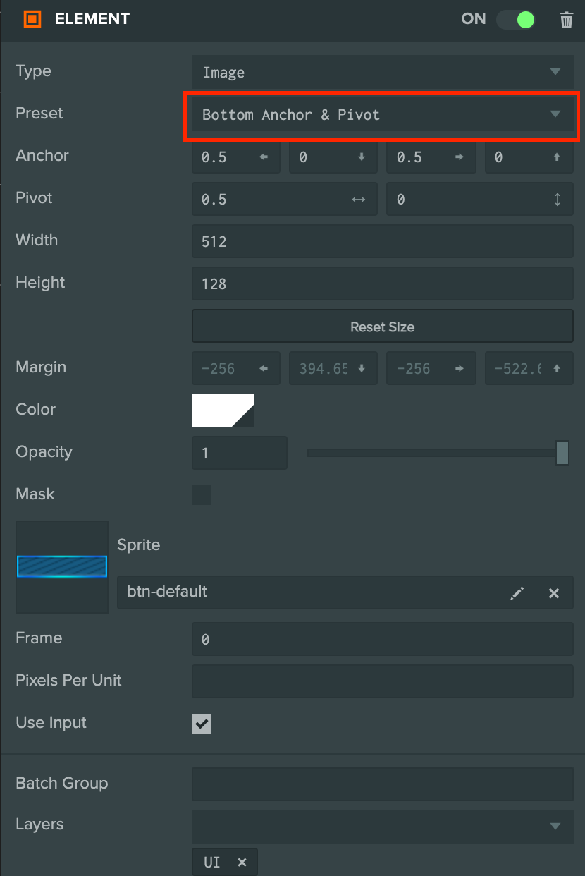
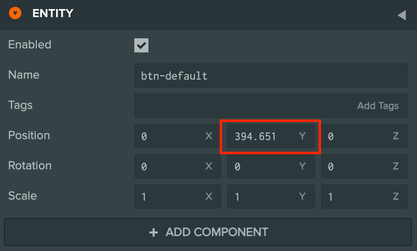
After anchoring the button we give it an offset from the bottom by simply moving it up.
We also have Use Input enabled in order to interact with the button.
Changing how the button looks on interaction
We can change how the button looks when the user interacts with the button for the following states:
- Hover - When the mouse cursor is over the button.
- Pressed - When the user presses on the button.
- Inactive - When the button is inactive.
This can be done via two Transition Modes:
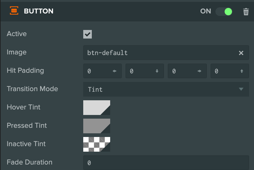
Tinting the color
Tinting the button color in each state is the easiest method to add some user feedback when they interact with it. In the project, the High Quality button has the following setup:
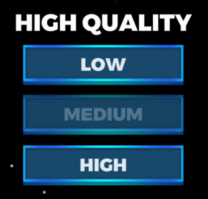
With the following effect:
Changing the Sprite
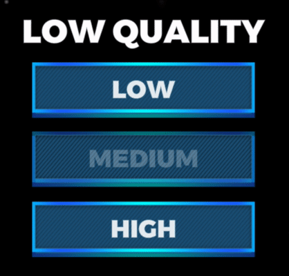
We can also change the sprite image of the button in the different states for cases where you may want the button to change shape or want to give a look of the button being 'pressed' into the screen. The Low Quality button has the following setup:
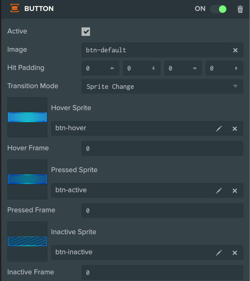
With the following effect:
Button events
We have a script in the project that listens for when the user clicks on the button and updates the text in the UI to the quality setting that they've selected.
var ButtonLogic = pc.createScript('buttonLogic');
ButtonLogic.attributes.add('textEntity', {
    type: 'entity',
    description: 'The entity that we want to update when the button is clicked'
});
ButtonLogic.attributes.add('description', {type: 'string'});

// initialize code called once per entity
ButtonLogic.prototype.initialize = function() {
    this.entity.button.on('click', function(event) {
        this.textEntity.element.text = this.description;
    }, this);
};
This script is attached to the button entities in the scene.
The Button component has a click event against which a callback function can
be registered that works for both mouse and touch input.
this.entity.button.on('click', function(event) {
    this.textEntity.element.text = this.description;
}, this);
There are other events that can be listened to such as mouseenter and mouseleave. A full list can be found in the API documentation.
These events will only fire if Use Input is enabled on the Element component so make sure that has been ticked in the inspector.